Global brand campaign highlighting the lives of people living with haemophilia, capturing the evolving nuances of their daily stories. The design approach manifested in refining and adapting the brand colour palette, we paired typographic key visuals with custom campaign imagery shot specifically to personify the everyday activities depicted in the visuals. This design system was implemented across digital collateral, exhibition graphics, a style guide, and an animated video, ensuring cohesive storytelling and consistent brand expression across multiple markets.
 ↗ Click to flip through
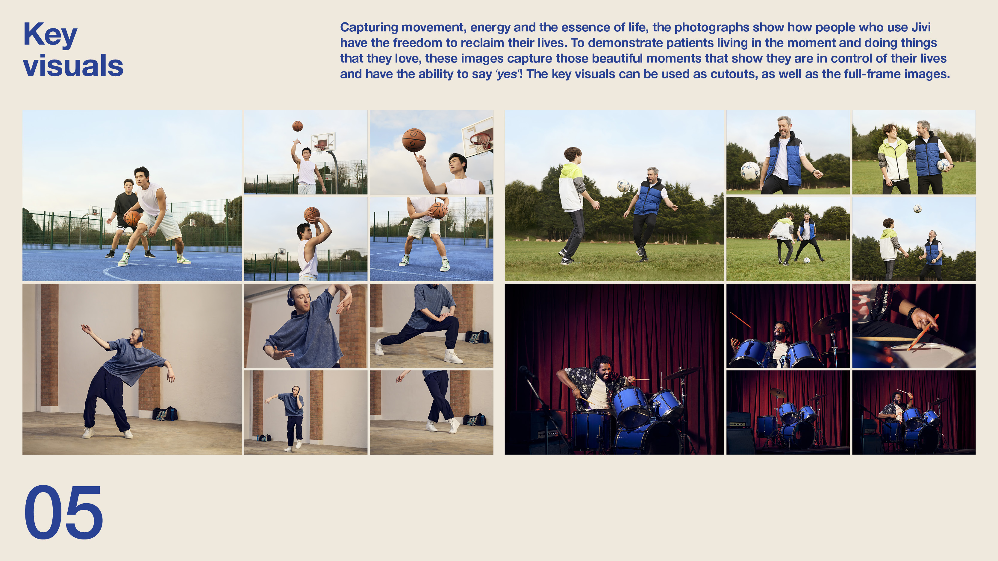
Art direction and design, adapting and refining the brand color palette, developing a distinct identity for a global brand campaign that highlights the lives of people living with hemophilia, reflecting their evolving experiences. Typographic key visuals were paired with campaign imagery to personify daily activities. A multi-platform rollout—including digital collateral, exhibition graphics, a style guide, and an animated video—ensured cohesive storytelling across multiple markets.
 ↗ Click to flip through
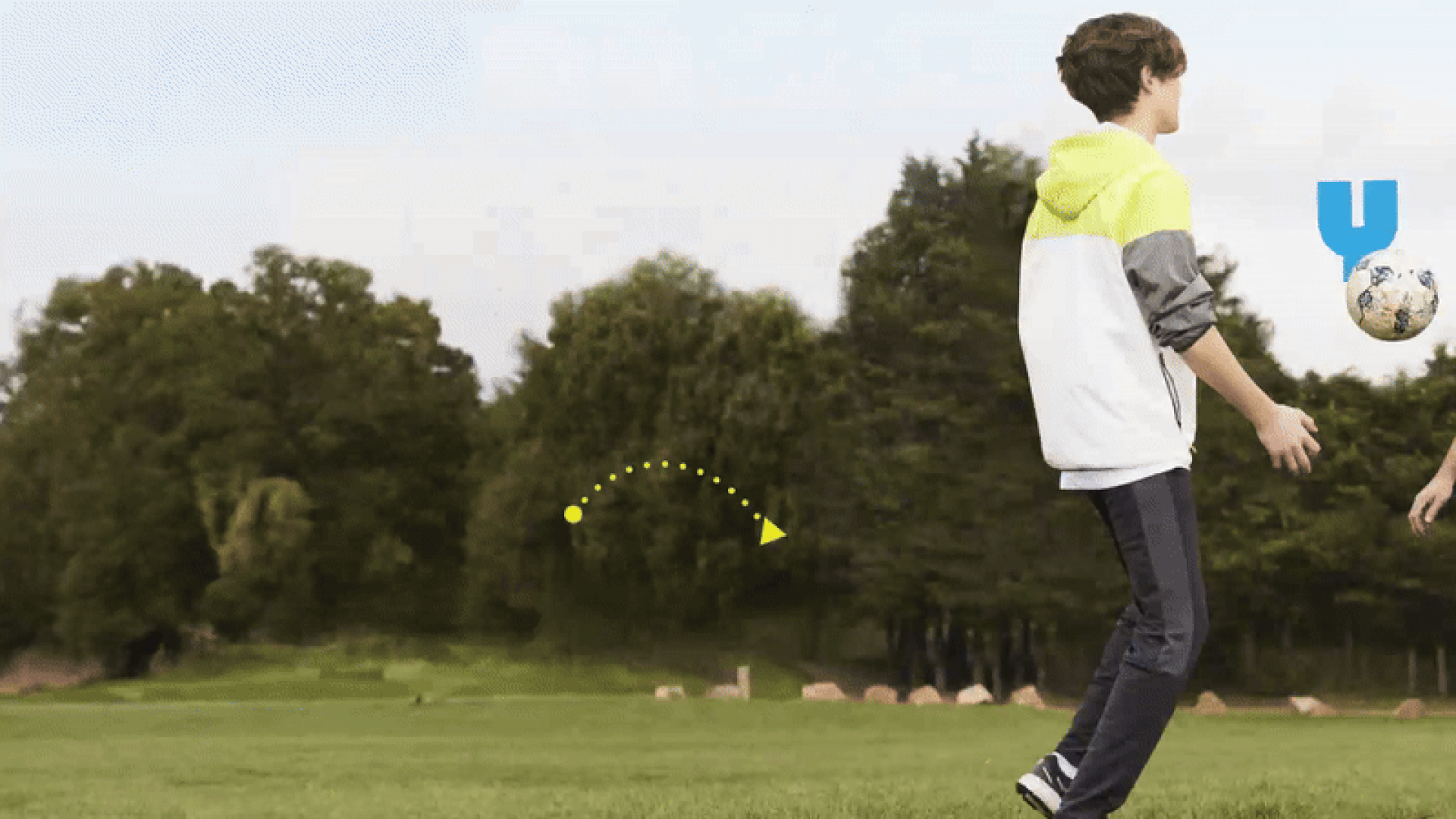
Art direction and design were closely developed to reflect the vibrancy of the brand's color palette, resulting in a diverse image library for data-driven digital reports. The photographs were dynamic and bold, yet flexible enough to accommodate a wide range of content.
 ↗ Click to flip through
Art direction and design were closely developed to reflect the vibrancy of the brand's color palette, resulting in a diverse image library for data-driven digital reports.
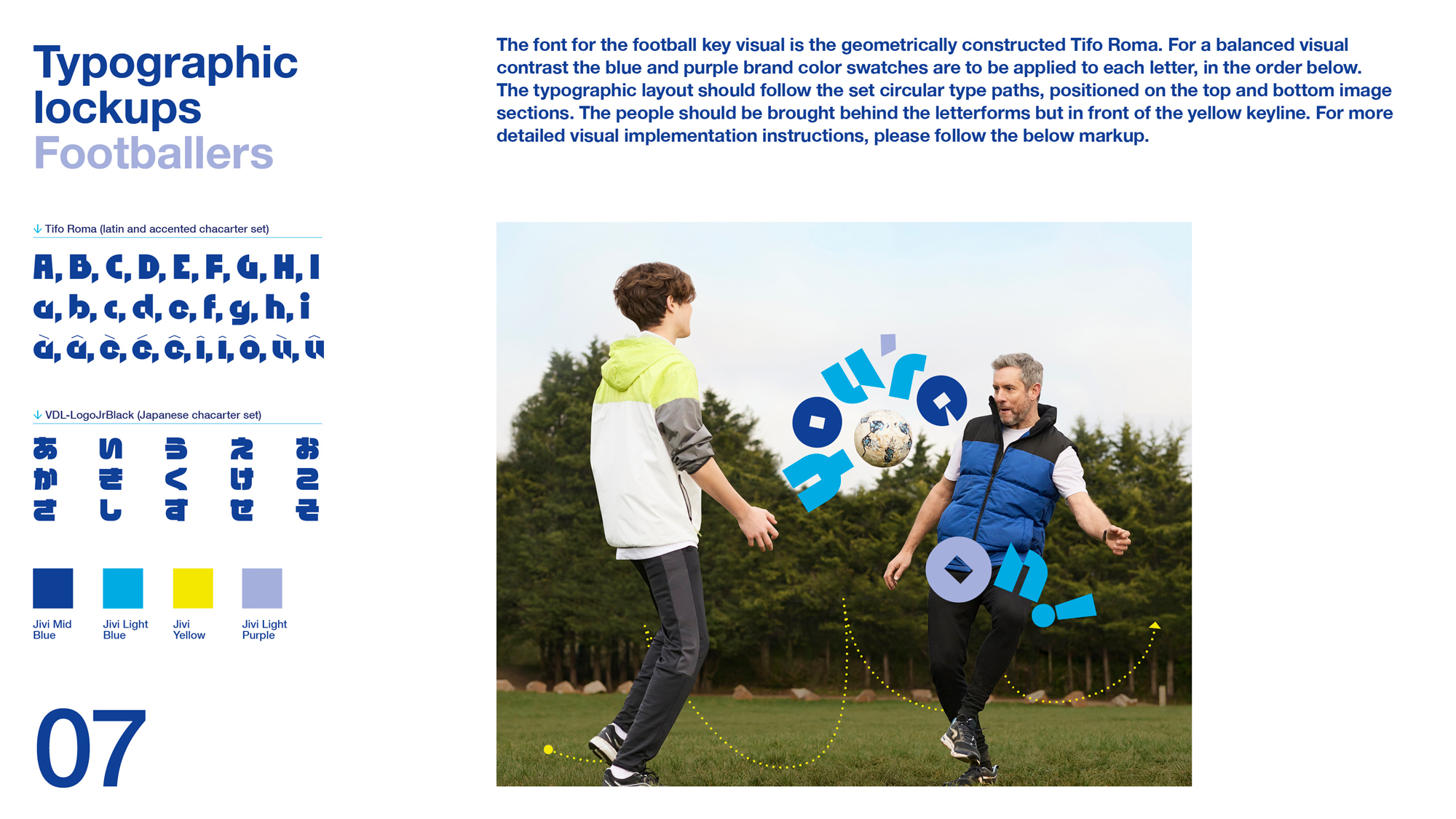
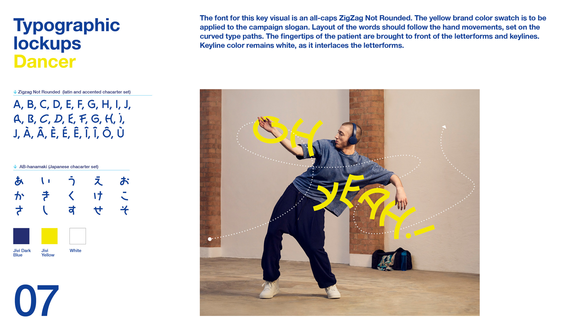
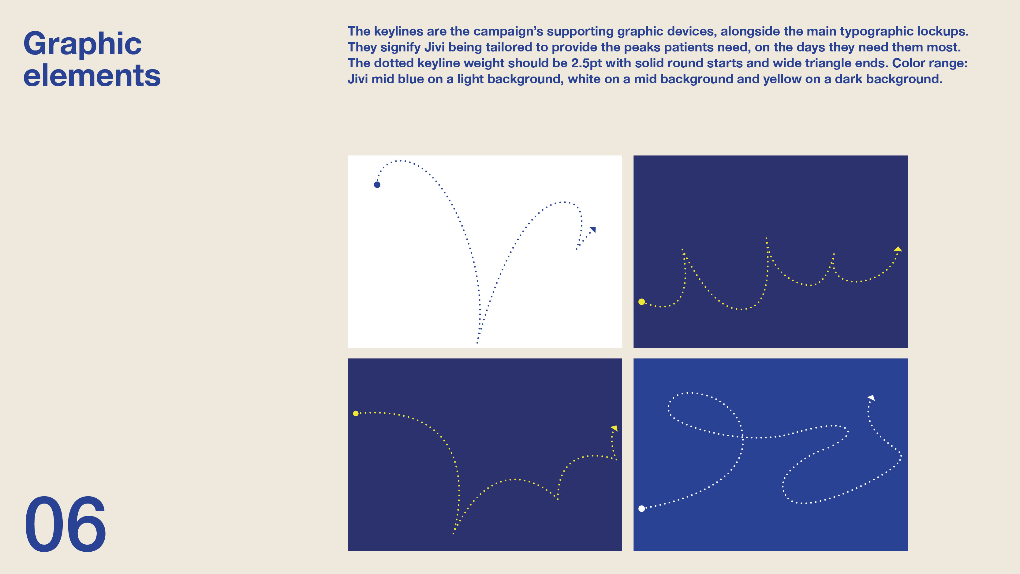
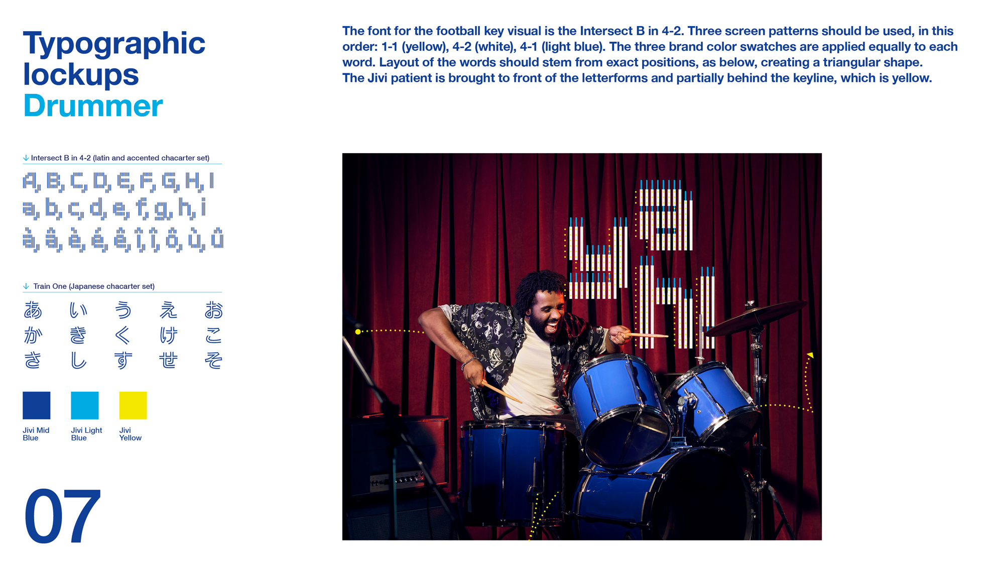
 Selected fonts work across multiple languages for the Latin alphabet. The employment of “Type as visual” frames the basis for the typography personifying the character of the talent within the photographs. Showing freedom of movement, especiallly in the joints is key. The design of the linear elements is highlighting movement, but also linking the Jivi bird. Their fluidity, balances the bold typography. Energy and strength manifests in vibrant, varied colours and bold letterforms. For confidence in harmony, the boldness is balanced out with an airy layout.
 ↗ Click to flip through
 ↗ Click to flip through
 ↗ Click to flip through
 ↗ Click to flip through