 ↗ Click to flip through
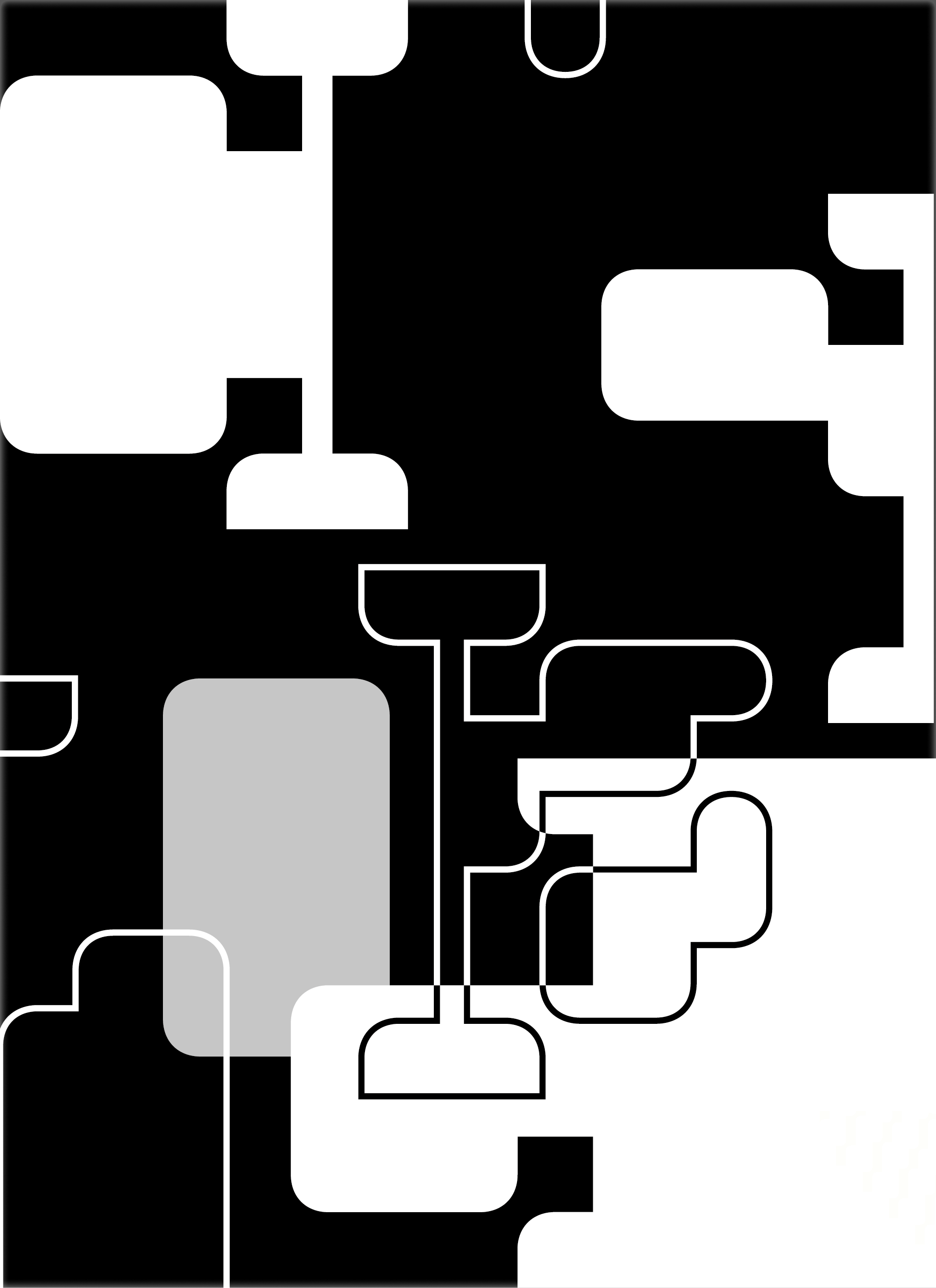
Experimental hands-on 'sketching' exploring the hidden 'character' of letters; to see them as forms and shapes as well as units of words and meanings. The aim was to challenge the ways in which we can visualise a set idea purely typographically. Scaling up typographic elements so that the micro-details of individual characters become apparent. Increasing the scale to the point at which the type forms are almost unrecognisable, like abstract shapes.
Exploring repetition and layering by overlapping or combining characters to create new type forms. Rotating elements to work with them at different angles, while arranging and composing. Restricting the work to one typeface and two colours maximum (but considering tints).
 ↗ Click to flip through
 ↗ Click to flip through
 ↗ Click to flip through
 ↗ Click to flip through
 The posters produced at the end also came to investigate negative space through typographic form & counterform. Exploring macro typography with the compositional arrangement and structuring of text blocks on the page. Exploring software techniques / skills appropriate to developing a design outcome.